Oggi mi sono divertito ad integrare dentro ad un modulo di Joomla un particolare effetto CSS3 creato da Mary Lou (un fenomeno, guardate anche gli altri tutorial) e descritto qui: http://tympanus.net/codrops/2012/08/08/circle-hover-effects-with-css-transitions/
Se cliccate su leggi tutto potrete vedere sopra l'articolo il modulo Joomla! creato per l'occasione.
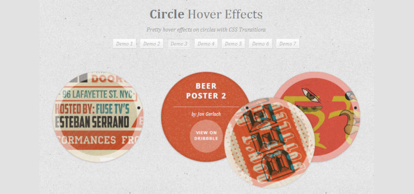
Ci sono 7 tipologie di effetti hover su immagini rese circolari tramite la proprietà "border-radius".
Quello che ho preso in considerazione è il numero 3, visibile qui:
http://tympanus.net/Tutorials/CircleHoverEffects/index3.html
In pratica, passando con il mouse sopra l'immagine, si ottiene l'effetto di far ruotare il cerchio superiore intorno ad un punto per scoprire quello sottostante che contiene alcune informazioni. Portando il mouse fuori dall'immagine, il cerchio torna al suo posto originario.
Bello vero?
Potete scaricarvi il file fornito da Mary Lou da questa pagina e studiarvelo, oppure seguite le mie istruzioni qui di seguito.
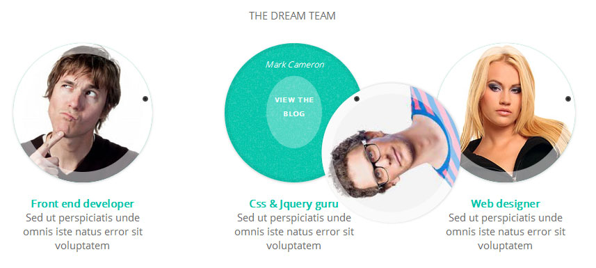
Ecco cosa otterrete:
1) creazione modulo Joomla!
andate nella gestione dei moduli e create un nuovo modulo del tipo html personalizzato.
Copiateci dentro il codice seguente:
<p> </p>
<p style="text-align: center;">THE DREAM TEAM </p>
<ul class="ch-grid">
<li>
<div class="xch-item">
<div class="xch-info">
<p>Martin Trenton <a href="http://www.virtualproject.it/blog">View the blog</a></p>
</div>
<div class="xch-thumb xch-img-1"> </div>
</div>
<br />
<div align="center"><a href="#" target="_blank"><strong>Front end developer</strong></a><br />Sed ut perspiciatis unde omnis iste natus error sit voluptatem</div>
</li>
<li>
<div class="xch-item">
<div class="xch-info">
<p>Mark Cameron <a href="http://www.virtualproject.it/blog">View the blog</a></p>
</div>
<div class="xch-thumb xch-img-2"> </div>
</div>
<br />
<div align="center"><a href="#" target="_blank"><strong>Css & Jquery guru</strong></a><br />Sed ut perspiciatis unde omnis iste natus error sit voluptatem</div>
</li>
<li>
<div class="xch-item">
<div class="xch-info">
<p>Sheila Diaz <a href="http://www.virtualproject.it/blog">View the blog</a></p>
</div>
<div class="xch-thumb xch-img-3"> </div>
</div>
<br />
<div align="center"><a href="#" target="_blank"><strong>Web designer</strong></a><br />Sed ut perspiciatis unde omnis iste natus error sit voluptatem</div>
</li>
</ul>
<p> </p>
<p> </p>
2) Inserimento dello stile
Adesso dobbiamo inserire il codice necessario a dare lo stile al nostro modulo. Per fare questo cercate il file css del template, che di solito si trova in questo percorso: templates/vostro_template/css/template.css
Se utilizzate dei framework il file potrebbe chiamarsi in un altro modo oppure il percorso potrebbe variare leggermente, l'importante è che scegliate un file css che viene caricato dal vostro template.
A questo punto aprite il file ed alla fine dello stesso copiate questo codice:
/* =================================================== */
/* 3° style circle css*/
.xch-item {
width: 100%;
height: 100%;
border-radius: 50%;
position: relative;
cursor: default;
box-shadow: 0 1px 3px rgba(0,0,0,0.2);
}
.xch-thumb {
width: 100%;
height: 100%;
border-radius: 50%;
overflow: hidden;
position: absolute;
box-shadow: inset 0 0 0 15px rgba(255,255,255, 0.5);
-webkit-transform-origin: 95% 40%;
-moz-transform-origin: 95% 40%;
-o-transform-origin: 95% 40%;
-ms-transform-origin: 95% 40%;
transform-origin: 95% 40%;
-webkit-transition: all 0.3s ease-in-out;
-moz-transition: all 0.3s ease-in-out;
-o-transition: all 0.3s ease-in-out;
-ms-transition: all 0.3s ease-in-out;
transition: all 0.3s ease-in-out;
}
.xch-thumb:after {
content: '';
width: 8px;
height: 8px;
position: absolute;
border-radius: 50%;
top: 40%;
left: 95%;
margin: -4px 0 0 -4px;
background: rgb(14,14,14);
background: -moz-radial-gradient(center, ellipse cover, rgba(14,14,14,1) 0%, rgba(125,126,125,1) 100%);
background: -webkit-gradient(radial, center center, 0px, center center, 100%, color-stop(0%,rgba(14,14,14,1)), color-stop(100%,rgba(125,126,125,1)));
background: -webkit-radial-gradient(center, ellipse cover, rgba(14,14,14,1) 0%,rgba(125,126,125,1) 100%);
background: -o-radial-gradient(center, ellipse cover, rgba(14,14,14,1) 0%,rgba(125,126,125,1) 100%);
background: -ms-radial-gradient(center, ellipse cover, rgba(14,14,14,1) 0%,rgba(125,126,125,1) 100%);
background: radial-gradient(ellipse at center, rgba(14,14,14,1) 0%,rgba(125,126,125,1) 100%);
box-shadow: 0 0 1px rgba(255,255,255,0.9);
}
.xch-img-1 {
background-image: url(../images/staff1.jpg);
z-index: 1112;
}
.xch-img-2 {
background-image: url(../images/staff2.jpg);
z-index: 1111;
}
.xch-img-3 {
background-image: url(../images/staff3.jpg);
z-index: 1110;
}
.xch-info {
position: absolute;
width: 100%;
height: 100%;
border-radius: 50%;
overflow: hidden;
background: #00C4AA url(../images/noise.png);
box-shadow: inset 0 0 0 5px rgba(0,0,0,0.05);
}
.xch-info h3 {
color: #fff;
text-transform: uppercase;
position: relative;
letter-spacing: 2px;
font-size: 18px;
margin: 0 60px;
padding: 22px 0 0 0;
height: 85px;
font-family: 'Open Sans', Arial, sans-serif;
text-shadow:
0 0 1px #fff,
0 1px 2px rgba(0,0,0,0.3);
}
.xch-info p {
color: #fff;
padding: 10px 5px;
font-style: italic;
margin: 10px 30px;
font-size: 12px;
border-top: 0px solid rgba(255,255,255,0.5);
}
.xch-info p a {
display: block;
color: #333;
width: 80px;
height: 80px;
background: rgba(255,255,255,0.3);
border-radius: 50%;
color: #fff;
font-style: normal;
font-weight: 700;
text-transform: uppercase;
font-size: 9px;
letter-spacing: 1px;
padding-top: 24px;
margin: 7px auto 0;
font-family: 'Open Sans', Arial, sans-serif;
opacity: 0;
-webkit-transition:
-webkit-transform 0.3s ease-in-out 0.2s,
opacity 0.3s ease-in-out 0.2s,
background 0.2s linear 0s;
-moz-transition:
-moz-transform 0.3s ease-in-out 0.2s,
opacity 0.3s ease-in-out 0.2s,
background 0.2s linear 0s;
-o-transition:
-o-transform 0.3s ease-in-out 0.2s,
opacity 0.3s ease-in-out 0.2s,
background 0.2s linear 0s;
-ms-transition:
-ms-transform 0.3s ease-in-out 0.2s,
opacity 0.3s ease-in-out 0.2s,
background 0.2s linear 0s;
transition:
transform 0.3s ease-in-out 0.2s,
opacity 0.3s ease-in-out 0.2s,
background 0.2s linear 0s;
-webkit-transform: translateX(60px) rotate(90deg);
-moz-transform: translateX(60px) rotate(90deg);
-o-transform: translateX(60px) rotate(90deg);
-ms-transform: translateX(60px) rotate(90deg);
transform: translateX(60px) rotate(90deg);
-webkit-backface-visibility: hidden;
}
.xch-info p a:hover {
background: rgba(255,255,255,0.5);
}
.xch-item:hover .xch-thumb {
box-shadow: inset 0 0 0 15px rgba(255,255,255, 0.5), 0 1px 3px rgba(0,0,0,0.2);
-webkit-transform: rotate(-110deg);
-moz-transform: rotate(-110deg);
-o-transform: rotate(-110deg);
-ms-transform: rotate(-110deg);
transform: rotate(-110deg);
}
.xch-item:hover .xch-info p a{
opacity: 1;
-webkit-transform: translateX(0px) rotate(0deg);
-moz-transform: translateX(0px) rotate(0deg);
-o-transform: translateX(0px) rotate(0deg);
-ms-transform: translateX(0px) rotate(0deg);
transform: translateX(0px) rotate(0deg);
}
/* grid */
.ch-grid {
margin: 20px 0 0 0;
padding: 0;
list-style: none;
display: block;
text-align: center;
width: 100%;
}
.ch-grid:after,
.ch-item:before {
content: '';
display: table;
}
.ch-grid:after {
clear: both;
}
.ch-grid li {
width: 200px;
height: 200px;
display: inline-block;
margin-top: 10px;
margin-left: 50px;
margin-right: 50px;
}
1) Preparazione ed inserimento immagini
Adesso scegliete 3 immagini a vostro piacimento e dategli queste dimensioni: 200 x 200 pixel
Per funzionare con il codice dell'esempio dovete rinominarle così: staff1.jpg, staff2.jpg, staff3.jpg
Se invece volete usare un nome diverso, dovete anche utilizzare questo nome nel foglio di stile, precisamente qui:
.xch-img-1 {
background-image: url(../images/staff1.jpg);
z-index: 1112;
}
.xch-img-2 {
background-image: url(../images/staff2.jpg);
z-index: 1111;
}
.xch-img-3 {
background-image: url(../images/staff3.jpg);
z-index: 1110;
}
Adesso caricate le immagini nella cartella templates/vostro_template/images ed il gioco è fatto. Pubblicando il modulo, se non avete fatto errori, otterrete un effetto come quello visualizzato nel modulo sopra a questo articolo.